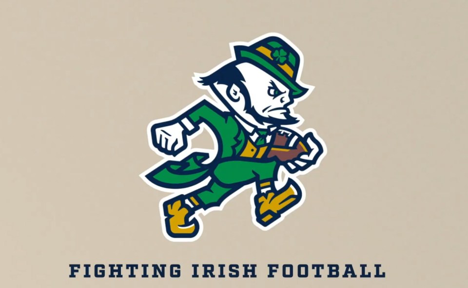
Notre Dame just dropped a new logo and the internet is already losing its mind. The Fighting Irish decided to give the classic leprechaun a fresh coat of paint, swapping out the old-school “dukes up” look for a football-in-hand design. Some people love it. Some people absolutely hate it. And of course, Twitter (sorry, X) is filled with fans acting like this is the end of college football tradition as we know it.
Here’s the thing: Notre Dame isn’t even replacing their iconic “ND” logo with this. The new leprechaun mark is more of a secondary look, a modernized spin that the school says was inspired by photos of past and current athletes. Honestly, it’s not a Cracker Barrel-level disaster rebrand. It’s not even in the same stratosphere as some of the NFL’s worst logo changes — looking at you, Dolphins and Browns.
Like it or not, Notre Dame found a way to update their brand without nuking tradition. Some fans think it’s a downgrade, others think it’s clean and modern. But no matter where you land, this logo is one of the most talked-about sports design moves in 2025.
Want the full breakdown? I went off about this in my latest video, and you’ll definitely want to check it out. Trust me, if you care about Notre Dame, college football tradition, or just bad sports logos, you’re gonna have an opinion on this one.


Leave a Reply